Storytelling with Data — Deliverable 3.3

BRISWA 2.0 • Work Package 3

Negative Neutral Positive

Storytelling with data: A Policy Brief and a Teaching Guide — This document has a dual purpose. It is written as a policy brief, using real data on racism and inclusion to highlight gaps between optimism, trust, and lived experience. At the same time, it serves as a teaching guide, showing step by step how graphs and infographics can be created in Python and then transformed into storytelling devices. The combination allows readers not only to understand the findings, but also to learn the methods behind them—so that the same tools can be applied in other contexts of social decision-making.

The BRISWA 2.0 survey reveals a generally optimistic picture: most (young) respondents trust their universities, view sport as a tool for integration, and expect inclusion to be a shared norm. At the same time, around one in five report direct experiences of racial discrimination, and almost none of them received assistance. The visualizations below are therefore used both as technical examples and as narrative devices to tell this more complex story, where institutional trust and optimism coexist with persistent episodes of racism in everyday spaces such as education, public life, social media, and sport.

ChartPythonData

Institutional perceptions (with age inset)

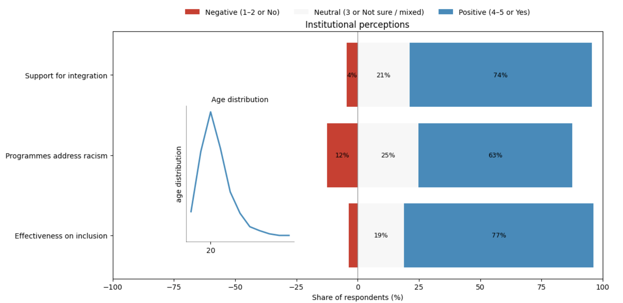
Diverging stacked bars (negative / neutral / positive) for three questions: Support for integration, Programmes address racism, and Effectiveness on inclusion. On the right, a small inset shows the age distribution of respondents, concentrated in early adulthood.

Responses were grouped into three blocks: negative (ratings 1–2 or “No”), neutral (rating 3 or “Not sure / mixed”), and positive (ratings 4–5 or “Yes”). Across all three questions, the chart shows a clear pattern: roughly three quarters of students give positive evaluations, a very small share are openly negative, and around one fifth remain in the neutral band. This neutral group is especially important, because it points to mixed experiences or uncertainty about how well institutions actually respond to racism and promote inclusion.

When read together with the age inset, the figure suggests an “optimistic but still forming” outlook: a predominantly young sample (mostly 18–24 years old) expresses trust in institutional efforts, yet a non-negligible portion hesitate to endorse them fully. These ambiguous responses provide an important backdrop for the experiences of discrimination shown in the next graphs.

Institutional perceptions chart with age inset
Click image to enlarge Download PDF
import matplotlib.pyplot as plt
from matplotlib.patches import Patch
import numpy as np

# --------------------------
# 1) Institutional trust data
# --------------------------
support_counts   = {1: 2, 2: 4, 3: 29, 4: 33, 5: 69}
prog_counts_raw  = {'No': 17, 'No, Not sure': 1, 'Not sure': 32, 'Yes': 86, 'Yes, No': 1}
effective_counts = {1: 1, 2: 4, 3: 26, 4: 51, 5: 55}

def likert_to_buckets(counts):
    total = sum(counts.values())
    neg = counts.get(1, 0) + counts.get(2, 0)
    neu = counts.get(3, 0)
    pos = counts.get(4, 0) + counts.get(5, 0)
    return neg, neu, pos, total

def yns_to_buckets(counts):
    neg = counts.get('No', 0)
    pos = counts.get('Yes', 0)
    neu = counts.get('Not sure', 0) + counts.get('Yes, No', 0) + counts.get('No, Not sure', 0)
    total = neg + neu + pos
    return neg, neu, pos, total

def to_pct(neg, neu, pos, total):
    f = 100.0 / total if total else 0
    return neg*f, neu*f, pos*f

sN, sU, sP = to_pct(*likert_to_buckets(support_counts))
pN, pU, pP = to_pct(*yns_to_buckets(prog_counts_raw))
eN, eU, eP = to_pct(*likert_to_buckets(effective_counts))

labels = [
    "Support for integration",
    "Programmes address racism",
    "Effectiveness on inclusion"
]
rows = [(sN, sU, sP), (pN, pU, pP), (eN, eU, eP)]

# Consistent colors
NEG_COLOR = "#d73027"  # negative (red)
NEU_COLOR = "#f7f7f7"  # neutral (light gray)
POS_COLOR = "#2b8cbe"  # positive (blue)

# --------------------------
# 2) Age distribution data
# --------------------------
ages = [
    24,20,22,22,18,21,19,25,20,20,21,19,20,18,24,22,19,23,22,21,
    21,21,20,20,19,18,19,21,20,22,21,20,20,20,20,20,20,19,20,20,
    20,20,20,23,26,25,20,21,22,20,23,19,20,22,20,19,20,20,19,20,
    19,20,21,20,20,21,20,18,21,19,20,19,20,20,23,22,21,22,20,20,
    20,19,20,20,20,19,20,22,20,20,20,20,19,20,20,21,20,22,20,20,
    19,20,22,21,21,23,21,20,20,20,20,22,19,19,21,22,24,19,19,22,
    28,20,20,21,20,19,20,22,18,20,22,19,20
]

ages_arr = np.array(ages, dtype=int)
bins = np.arange(ages_arr.min()-0.5, ages_arr.max()+1.5, 1)  # 1-year bins
counts, bin_edges = np.histogram(ages_arr, bins=bins)
centers = (bin_edges[:-1] + bin_edges[1:]) / 2.0

# Smooth histogram with a simple moving average
kernel = np.array([1, 2, 1], dtype=float)
kernel = kernel / kernel.sum()
smooth = np.convolve(counts, kernel, mode='same').astype(float)
if smooth.max() > 0:
    smooth = smooth / smooth.max()  # normalize 0–1

# Mode age (dominant)
unique, cts = np.unique(ages_arr, return_counts=True)
mode_age = int(unique[np.argmax(cts)])  # likely 20 or 21

# --------------------------
# Plot: main chart + inset
# --------------------------
fig, ax = plt.subplots(figsize=(12, 6))

# Diverging stacked bars
ypos = list(range(len(rows)))[::-1]
for y, (neg, neu, pos) in zip(ypos, rows):
    ax.barh(y, -neg, left=0, align='center', color=NEG_COLOR, edgecolor='none')
    ax.barh(y, neu, left=0, align='center', color=NEU_COLOR, edgecolor='none')
    ax.barh(y, pos, left=neu, align='center', color=POS_COLOR, edgecolor='none')

ax.set_yticks(ypos)
ax.set_yticklabels(labels)
ax.set_xlim(-100, 100)
ax.set_xlabel("Share of respondents (%)")
ax.axvline(0, linewidth=1, color="#999999")
ax.set_title("Institutional perceptions")

# Segment annotations
def annotate(x_left, width, y, text):
    if abs(width) < 4: return
    ax.text(x_left + width/2, y, text, va='center', ha='center', fontsize=9)

for y, (neg, neu, pos) in zip(ypos, rows):
    annotate(-neg, neg, y, f"{neg:.0f}%")
    annotate(0, neu, y, f"{neu:.0f}%")
    annotate(neu, pos, y, f"{pos:.0f}%")

# Legend
handles = [
    Patch(facecolor=NEG_COLOR, edgecolor='none', label="Negative (1–2 or No)"),
    Patch(facecolor=NEU_COLOR, edgecolor='none', label="Neutral (3 or Not sure / mixed)"),
    Patch(facecolor=POS_COLOR, edgecolor='none', label="Positive (4–5 or Yes)")
]
ax.legend(handles=handles, loc="upper center", ncol=3, bbox_to_anchor=(0.5, 1.12), frameon=False)

# --------------------------
# Inset: small age distribution on the right
# --------------------------
mini = ax.inset_axes([0.15, 0.15, 0.22, 0.55])  # x0, y0, width, height
mini.set_facecolor("white")

mini.plot(centers, smooth, color=POS_COLOR, lw=2)

# Only one x tick at dominant age
mini.set_xticks([mode_age])
mini.set_xticklabels([str(mode_age)])

# No y ticks; vertical label
mini.set_yticks([])
mini.set_ylabel("age distribution", rotation=90)

# Clean look
for spine in ["top", "right"]:
    mini.spines[spine].set_visible(False)
mini.spines["bottom"].set_alpha(0.4)
mini.spines["left"].set_alpha(0.4)

mini.set_title("Age distribution", pad=6, fontsize=10)

plt.tight_layout()
plt.show()
ChartPython

Experienced racial discrimination?

Donut chart summarising whether respondents have experienced racial discrimination since arriving in their host country. The “Yes” segment combines clear “Yes” answers and mixed “Yes, No” entries; an inner label reports the overall share of students who have faced discrimination, together with the tiny fraction who received assistance afterwards.

Out of 137 respondents, 109 answered “No”, 26 answered “Yes”, and 2 ticked both “Yes” and “No”. Taken together, this means that 28 students—around one in five—reported having personally experienced racial discrimination. Among these, only a single respondent (3.6% of the “Yes” group) reported that they received assistance. For nearly everyone else, either support was not offered, not accessible, or not requested.

The text box to the right of the donut breaks down the contexts in which those 28 students experienced discrimination. More than half mention public spaces, almost half mention educational settings, and over one third refer to social media. Only a small share explicitly mention football. These patterns underline that incidents concentrate in everyday public and institutional life, precisely in the spaces where, as later charts show, institutional trust and optimism are otherwise relatively high.

Donut: experienced racial discrimination
Click image to enlarge Download PDF
import matplotlib.pyplot as plt

# --- Inline survey data (exact tallies) ---
discr_experience = {"No": 109, "Yes": 26, "Yes, No": 2}
n_total = sum(discr_experience.values())
n_yes = 26 + 2   # count "Yes" + mixed

# Context percentages among the 28 "Yes"
context_info = [
    "Of those who responded Yes:",
    "57.1% experienced discrimination in a public space",
    "46.5% experienced discrimination in an educational setting",
    "39.3% experienced discrimination in Social media",
    "7.1% experienced discrimination in a football setting"
]

# --- Donut chart ---
fig, ax = plt.subplots(figsize=(8, 6))
sizes = list(discr_experience.values())
labels = list(discr_experience.keys())

# Consistent color scheme: blue = No, red = Yes, gray = Yes/No
colors = ["#1f77b4", "#d62728", "#bdbdbd"]  

wedges, _ = ax.pie(sizes, startangle=90, colors=colors)

# Donut hole
centre_circle = plt.Circle((0, 0), 0.60, fc="white")
ax.add_artist(centre_circle)

# Title
ax.set_title("Experienced racial discrimination?")

# Central text
pct_yes = round(100.0 * n_yes / n_total, 1)
ax.text(0, 0.07, f"{pct_yes}%", ha="center", va="center", fontsize=12, weight="bold")
ax.text(0, -0.06, "reported ‘Yes’", ha="center", va="center", fontsize=11)
ax.text(0, -0.20, "3.6% of ‘Yes’ received assistance",
        ha="center", va="center", fontsize=9, color="darkred")

# Legend box positioned near the "Yes" slice (red, right side)
legend_text = "\n".join(context_info)
ax.text(1.2, 0, legend_text,
        ha="left", va="center",
        fontsize=10,
        bbox=dict(boxstyle="round,pad=0.5", fc="white", ec="0.5"))

ax.set_aspect('equal')
plt.tight_layout()
plt.show()
ChartPython

Sport: integration tool & active site of discrimination

Combined infographic connecting three perspectives on sport: the main types of anti-racism programmes identified in project analyses (with “Sport as tool for integration” highlighted); survey responses to the question whether sport is seen as an effective anti-racism tool; and the contexts in which students who experienced discrimination say that incidents occurred, including a small slice for football.

In the survey, 92% of respondents answered “Yes” when asked if sport can be a tool for integration across cultures, while only a small minority disagreed. This belief echoes how sport appears in programme analysis: many initiatives use sport and football as a primary vehicle to promote inclusion, alongside community forums, support to vulnerable groups, awareness-raising actions, and education and training.

At the same time, football is not only part of the solution but also part of the problem. In the breakdown of discrimination contexts, a 7.1% slice corresponds to incidents explicitly linked to football settings. Placing this slice next to the overwhelmingly positive belief in sport and the prominence of sport-based programmes creates a deliberate tension: sport is celebrated as a powerful anti-racist tool, yet it remains an arena where racism and harassment can still emerge and must be actively addressed.

Sport as integration tool and challenge infographic
Click image to enlarge Download PDF
import matplotlib.pyplot as plt
from matplotlib.patches import Patch
import math

# -----------------------
# Inline data (as given)
# -----------------------
program_groups = {
    "Sport as tool for integration": 1,  # highlighted
    "Community forums & dialogue": 1,
    "Support for vulnerable groups": 1,
    "Awareness-raising": 1,
    "Education & training": 1
}

sport_counts = {"Yes": 126, "No": 11}  # survey belief in sport as integration

# Contexts among those who experienced discrimination (share within 'Yes' group)
contexts_pct = {
    "Public space": 57.1,
    "Educational setting": 46.5,
    "Social media": 39.3,
    "Football setting": 7.1  # highlight this
}

# -----------------------
# Look & feel
# -----------------------
HIGHLIGHT = "#2b8cbe"   # vivid blue
PALE      = "#cdd9e5"   # pale blue/gray for toned-down bars
NO_TONE   = "#c7c7c7"   # toned-down gray for "No"
PIE_PALE  = "#e6e6e6"   # pale for non-highlighted pie slices
PIE_HI    = "#d73027"   # highlight color for football slice (stands out)

# -----------------------
# Layout: 2x2 grid (bottom spans both columns)
# -----------------------
fig = plt.figure(figsize=(12.5, 8), constrained_layout=True)
gs  = fig.add_gridspec(2, 2, height_ratios=[1, 1.1])

# --- Top-left: Program groups (highlight 'Sport') ---
ax0 = fig.add_subplot(gs[0, 0])
labels_pg = list(program_groups.keys())
values_pg = list(program_groups.values())
colors_pg = [HIGHLIGHT if "Sport" in lab else PALE for lab in labels_pg]
ax0.barh(labels_pg, values_pg, color=colors_pg)
ax0.set_xlim(0, 1.2)
ax0.set_xticks([])
ax0.set_title("Anti-racism program types", pad=6)
for i, lab in enumerate(labels_pg):
    ax0.text(0.05, i, lab, va="center", ha="left", fontsize=10, color="black")

# --- Top-right: Yes/No belief (Yes highlighted, No toned down) ---
ax1 = fig.add_subplot(gs[0, 1])
yn_labels = list(sport_counts.keys())
yn_vals   = list(sport_counts.values())
yn_colors = [HIGHLIGHT if lab == "Yes" else NO_TONE for lab in yn_labels]
bars = ax1.bar(yn_labels, yn_vals, color=yn_colors)
ax1.set_title("Do students see sport as an effective anti-racism tool?", pad=6)
ax1.set_ylabel("Number of respondents")
for b in bars:
    ax1.text(b.get_x() + b.get_width()/2, b.get_height() + 0.8, f"{int(b.get_height())}", ha="center", va="bottom", fontsize=10)

# --- Bottom: Pie (contexts) — only 'Football' highlighted ---
ax2 = fig.add_subplot(gs[1, :])
labels_ctx = list(contexts_pct.keys())
values_ctx = list(contexts_pct.values())
colors_ctx = [PIE_HI if "Football" in lab else PIE_PALE for lab in labels_ctx]
wedges, texts = ax2.pie(values_ctx, colors=colors_ctx, startangle=90)
ax2.set_title("Where discrimination occurs (among those who reported it)", pad=8)
legend_handles = [
    Patch(facecolor=PIE_HI,  label="Football setting"),
    Patch(facecolor=PIE_PALE, label="Other contexts")
]
ax2.legend(handles=legend_handles, loc="center left", bbox_to_anchor=(0.02, 0.5), frameon=False)

fb_idx = labels_ctx.index("Football setting")
fb_wedge = wedges[fb_idx]
angle = (fb_wedge.theta2 + fb_wedge.theta1) / 2
r = 1.1
x = r * math.cos(math.radians(angle))
y = r * math.sin(math.radians(angle))
ax2.text(x, y, "7.1%", ha="center", va="center", fontsize=11, weight="bold")

plt.show()
ChartPython

Demographic indicators

Double-donut infographic built from external indicators on migration in Spain. The inner ring shows women among newly nationalised citizens (57%), while the outer ring highlights the share of migrant women living in severe poverty (16.7%). Both measures are drawn from the broader demographic context used in the report.

These two percentages serve different roles in the story. The inner ring emphasises that women make up the majority of new nationals, in a context where over two hundred thousand nationality grants were issued in a single year. The outer ring reminds us that a significant minority of migrant women face severe poverty, even when formal integration through nationality and permits is progressing. In the full report, these indicators are complemented by age comparisons and permit stability; here, the focus is on how gendered vulnerability intersects with formal inclusion.

By juxtaposing these rings, the graphic anchors the BRISWA 2.0 survey in broader structural realities: demographic trends and vulnerability indicators in Spain shape the background against which individual experiences of racism, trust, and discrimination should be interpreted. Policies that aim to combat racism must therefore be informed by such demographic patterns from the outset.

Double donut: demographic indicators
Click image to enlarge Download PDF
import matplotlib.pyplot as plt
from matplotlib.patches import Patch

# Values
women_share = 57.0        # inner ring (blue)
severe_poverty = 16.7     # outer ring (red)

# Style
START = 90
OUTER_R, OUTER_W = 1.3, 0.28   # outer radius, width
INNER_R, INNER_W = 0.85, 0.28  # inner radius, width

BLUE_HI,  BLUE_REST  = "#1f77b4", "#dbe9f6"
RED_HI,   RED_REST   = "#d62728", "#f8c9c9"

fig, ax = plt.subplots(figsize=(7.2, 7.2))

# --- OUTER donut: migrant women in severe poverty (16.7% highlighted) ---
outer_vals   = [severe_poverty, 100 - severe_poverty]
outer_colors = [RED_HI, RED_REST]
ax.pie(outer_vals,
       radius=OUTER_R,
       startangle=START,
       colors=outer_colors,
       counterclock=False,
       wedgeprops=dict(width=OUTER_W, edgecolor="white"))

# --- INNER donut: women among new nationals (57% highlighted) ---
inner_vals   = [women_share, 100 - women_share]
inner_colors = [BLUE_HI, BLUE_REST]
ax.pie(inner_vals,
       radius=INNER_R,
       startangle=START,
       colors=inner_colors,
       counterclock=False,
       wedgeprops=dict(width=INNER_W, edgecolor="white"))

# Cosmetics
ax.set(aspect="equal")
ax.axis("off")
ax.set_title("Demographic indicators", pad=10, fontsize=14, weight="bold")

# Legends (right side)
handles = [
    Patch(facecolor=RED_HI,  label=f"Migrant women in severe poverty (Spain): {severe_poverty:.1f}%"),
    Patch(facecolor=BLUE_HI, label=f"Women among new nationals (Spain): {women_share:.0f}%"),
]
ax.legend(handles=handles, loc="center left", bbox_to_anchor=(1.05, 0.0), frameon=False)

plt.tight_layout()
plt.show()

Implications

Taken together, the graphs show more than isolated statistics. They reveal an underlying optimism among respondents — most students trust their institutions, believe that programmes address racism, and see sport as a tool for integration. This optimism is closely linked to the demographic profile of the sample: a predominantly young group that expects inclusion to be the norm rather than the exception.

At the same time, the visual story highlights that discrimination persists despite this optimism. One in five respondents report personal experiences of racial discrimination, concentrated in public spaces, education, social media, and, to a lesser extent, football. Only 3.6% of those who experienced discrimination received assistance. The gap between trust in institutions and the lack of concrete support when incidents occur is therefore a central policy concern.

Sport illustrates this tension particularly well. It is celebrated as an effective anti-racist tool and used as a platform for integration programmes, yet it remains an active site of discriminatory incidents. This dual role suggests that symbolic commitments to fair play and respect need to be matched by robust mechanisms that prevent, monitor, and respond to racism in sporting environments.

Finally, the demographic indicators remind us that experiences and policies around racism are embedded in broader structural conditions: patterns of migration, age distributions, gender imbalances, permit stability, and vulnerability to poverty. For public institutions, universities, and sports organisations, optimism alone is not enough. Mechanisms and frameworks are needed to:

  • translate institutional trust into accessible and effective support when discrimination occurs;
  • ensure that sport-based programmes convert their strong symbolic value into concrete anti-racist action;
  • design policies that are informed from the outset by demographic realities and vulnerability indicators.

Without this alignment between data, context, and action, any strategy to combat racism risks remaining aspirational rather than effective.

Scroll to Top